


Now that was fun: at the recommendation of Daughter Number Three, I took a trip to the site of marksimonsom.com to read about the type used on Mad Men. For anyone out there who is font-sensitive, this is a great excursion.
And damn – they are getting it wrong on Mad Men too much of the time! I especially liked Simonson's observati0ns about the Holy Innocents dance poster, because on the show Peggy Olsen so adamantly defended that poster (and the better judgment of the designer). Perhaps with a break between seasons, creative can get up to speed on this dimension of Mad Men: so important for an ad agency.
Mark Simonson is a freelance graphic designer and type designer in St. Paul, Minnesota, whose past work includes a lot of the Garrison Keiller ephemera from the 80s and 90s, as well as art direction for the Utne Reader of the mid-80s. (I still have a few of those old Utne Readers, I must confess.) If the old Lake Wobegon packaging pulls at your heartstrings, you must make it over to take a look at what he is up to now. He's a acute observer of the ways in which lettering and type are always over-determined, communicating extra effects as they mediate language. (By the way, don't get them confused: as Simonson puts it, "Lettering differs from type in the same way that modeling clay differs from Lego bricks." And language is not the same as lettering, fonts, type, speech, or communication.)
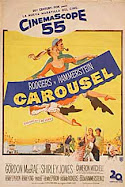
This guy knows type inside out, and it looks as if the television and film industry would be wise to hire him as a consultant. Click here to find the very interesting piece Typecasting: The Use (and Misuse) of Period Typography in Movies.


.jpg)


.jpg)


No comments:
Post a Comment